a spark, a flame, a fire

A humanist brand identity for an independent café in the heart of the Peak District.
A minimalist logo design and brand identity for a small Manchester based bespoke furniture business.
What Sara Needed
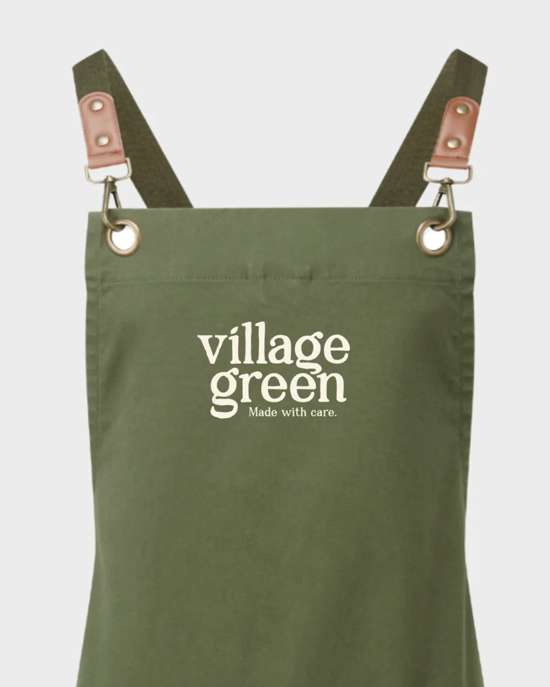
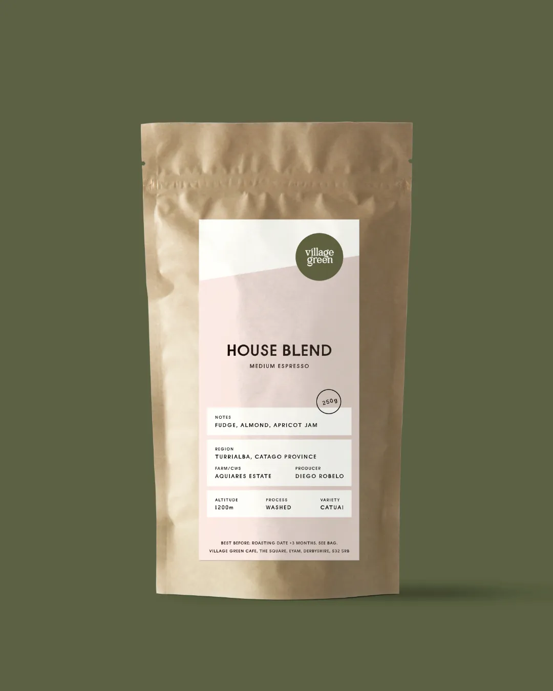
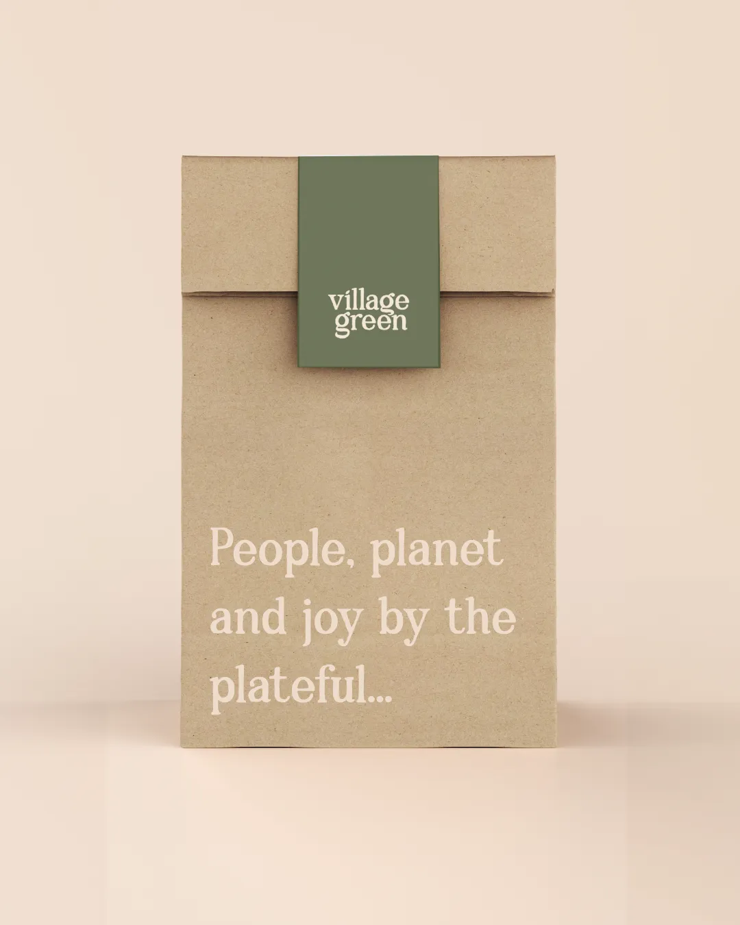
Village Green needed a brand identity that could do a lot of heavy lifting from day one. As an established but changing independent café in Eyam in the Peak District, they needed to stand out in a competitive landscape, feel distinct from the big chains, and look consistent across every channel, from their exterior signage and takeaway cups to their staff uniforms and Instagram presence. The brief was to create something with real character that would feel at home in the landscape and community around them, while being practically built to work in print, large format, embroidery, and digital from the start.
How I helped
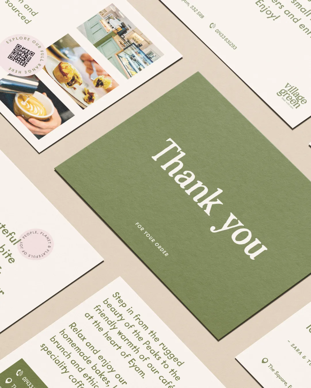
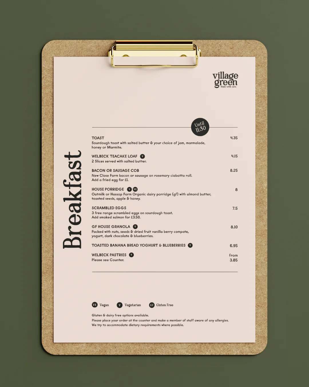
Concept development, Logo Design, Colour Palette, Typography, Brand Guidelines, Print-ready and Digital file deliverables including Coffee Packaging, Menus, Signage, Window Graphics, Promotional Postcards, Gift Vouchers, Thankyou Cards, Aprons, Food Labels and Table Cards.
Logo design
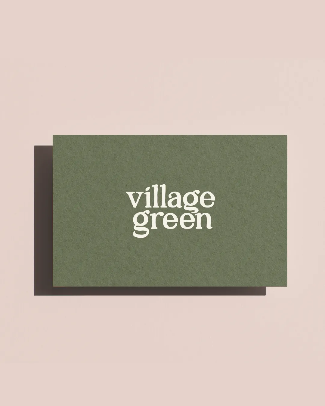
The logo for VIallge Green is humanist at heart. It takes a hand drawn font and customises it to create a contemporary, cohesive logo. It was designed from the outset to be versatile. It's single colour design allows for easy application to various reproduction methods such as spot colour printing on packaging to social media to embroidered or screen printed apparrel. The logo is confident, playful and inviting, reflecting the people centred, ethical values of the family run indie cafe.
Identity
The colour palette draws from the earthy, muted tones of the moorland and the soft, eco conscious values of the cafe itself. In contrast to create a contemprary feel, the complementary blush shade is used to create a feeling of playfulness and friendliness. defined in HEX, RGB, CMYK and Pantone to ensure consistency whether it's appearing on a screen, a printed menu, or a kraft paper cup.
Typography was carefully chosen to balance human warmth and practical legibility, working equally well at small sizes on a loyalty card and large scale on an exterior board. Together, the palette, type, and mark create a brand that feels genuinely rooted in where Village Green is and what it stands for. Learn more about getting started with your own cafe identity here.